top of page

PUBLICATION
DESIGN
Publication Design offers the potential of typographic expression while allowing exploration in different materials, aesthetic styles, and types of publications. No publication is alike and each serves a unique purpose and an even greater and engaging design experience.
PROJECTS
This project-centered around the conceptual design of the Royal Botanical Gardens Annual Report. Involving the use of multiple skills including typesetting and formating, the Abode suite, and illustration. With complete control over the visual aesthetics and style, a conceptual approach was taken that reflects the values and traditions of the gardens, while visually representing their natural setting.
While the use of a bold green colour palette presents the garden’s natural aspects, an additional motif was added to represent their Prestige, reputation and stature.
The limitation of the project included a maximum of 36 pages, so typography and grid systems were carefully considered, ensuring the design remained clean and polished.
ROYAL BOTANIC
GARDENS
FRENETIC AESTHETICS:
This project involved designing a publication that reflected and presented an existing publication. The chosen text was Mattew J.Raimondo's paper titled "The Frenetic Aesthetics: Observational Horror and spectatorship." It explores themes of the unseen and hidden within horror movies, that what is unseen can be just as scary as graphic or visual horror. My goal was to represent these themes and aesthetics within my own design.
I utilized many elements to make the publication feel mysterious and haunting, from the use of harsh dark colors, high contrast and freakish imagery, and hand-generated type for the chapter headings, created using a scanner to create a glitched and uncertain effect.
Parts of the publication were also blacked out, a similar process used to classify private and police-related documents. However, some words remain, leaving ominous warnings and messages. Suggesting an unseen or unknown person has tampered with the publication.
RE-PUBLISHING OF
GRIMMS CLASSIC
FAIRY TALES
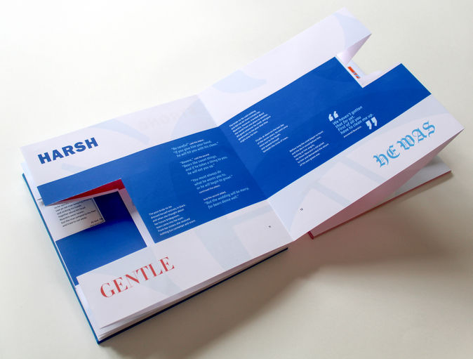
This project centered around the adaptation and re-publication of the classic Grimm’s Brothers fairy tales, depicting the two stories of Briar Rose (Sleeping Beauty) and Bear Skin (War Hero/ Warrior). It explores themes of gender roles, and language, through an Accordian style publication.
It intergrates a two-sided design with unquie cut-out fearures, intended to disrupt and deconstract to linear path and binary nature of the two sides. It encourages the reader to manipulate and contort the publication, moving words into new places and positions, convaying the idea that a princess can be both delicate and strong, while a warrior fearless and vulnerable.

.jpg)


BUSHFIRE
ACTION PLAN
This project called for a Brochure design, intended to aid Australian citizens in a type of Emergency. I chose to focus on a Bushfire Emergency Action Plan, given the recent devastation of the 2020 bushfires here in Australia.
The intention was for both younger and old Australians would be able to use this brochure, with more detailed information within the fold-out sections and an easier to understand action plan in the center. The back of the design also included a section of important numbers, as well as a second section where additional phone numbers could be added.
This design also took into account the diversity of our nation, and had 5 translated versions of the design, ensuring the important information was accessible to the top 5 spoken languages of Australia.
MELBOURNE TOURISM PUBLICATION
This project involved representing an aspect of Melbourne Tourism within a printed publication. Melbourne Streetart and graffiti scene were chosen, and the publication centered around informing young potential or beginning street artists. It resented information such as locations, techniques, and equipment.
The design and visual aesthetic took inspiration and paid homage to famous anonymous street artist Banksy, with a primary black and white palette, with the inclusion of a bold red for a dramatic impact. Some of his most well-known artworks were then used as die-cuts within the publication. The publication is unique, using a Zine style format, meaning the poster design can be seen through the die-cuts.
The intention behind this was so beginner graffiti artists could practice their stenciling techniques with die-cut visuals. So artists could learn from the publication, as well as hone their skills.
THE CIRCLE
AUTHOR: DAVE EGGERS
This project involved visually representing the themes and motifs within Dave Eggers novel “The Circle”. The novel revolves around the main character discovering secrets hidden behind a seeming Utopia world. Exploring themes such as; Surveillance, Privacy, Utopisum, and Control. All of which were explored and represented within these designs.
Skills involved in this project included; image manipulation, typography, and dynamic conceptual development. The serves as graphic warming, conveying the distortion of personal identity through technology, as the line between accessibility and freedom blurs, in a potential future where lives are run by the machine and the internet.
THREE CORNERS OF THE CITY: DYNAMIC DATA ART
This was a freelance design completed for a collaborative project between The City of Casey and Swinburne University. Their project involved creating live data art, that would be collected around the Casey community and displayed in their town hall.
My role in this project was to design them a postcard, using snapshots and text taken directly from the project. I was responsible for the typographic choices and layout.
What makes this design unique, however, is that it's not a traditional two-sided postcard. Instead, it's a folded card, which is perforated along the fold. This allows the community to keep part of the design as a keepsake while being able to mail back the activity part back to the council, the communities responses potentially leading to future community improvements and changes.
bottom of page


